It’s been a while since I last updated my website. I haven’t blogged regularly at all, but also the content generally has gotten out of date and no longer reflected where I am at this point. Most of you probably know the problem, you work on open-source, client projects, and products so much that you forget to update your own hub that should probably, better than anything else, represent your skillset, focuses and achievements. As of now, this website finally is back there for me. Given the increasing amount of new major WordPress features and web technologies, I finally made myself make some time for implementing some of those as part of a refresh of my site. In this post I’d like to tell a bit more about what I focused on.
The New Editing Experience
I’m not going to explain what Gutenberg is because you likely all know it by now. Although there have been concerns on my end about certain parts of the project, I have always appreciated the idea and how it can be able to benefit WordPress users from the start. Having mostly focused on PHP development and not having any prior experience with React, I didn’t really dive into programming with Gutenberg though, also because it was still a bit too unstable at the times where I could have leveraged it in projects. I did learn React now, as certain sections I wanted for this website make perfect use-cases for blocks. While I had been running a beta version of Gutenberg on my site for more than a year, now I finally truly leverage it: All the non-WordPress-core-ish content that you see as part of the main content of each page is based on a custom block type. Shortcodes have been eliminated, and some of them have been directly replaced with a block type.

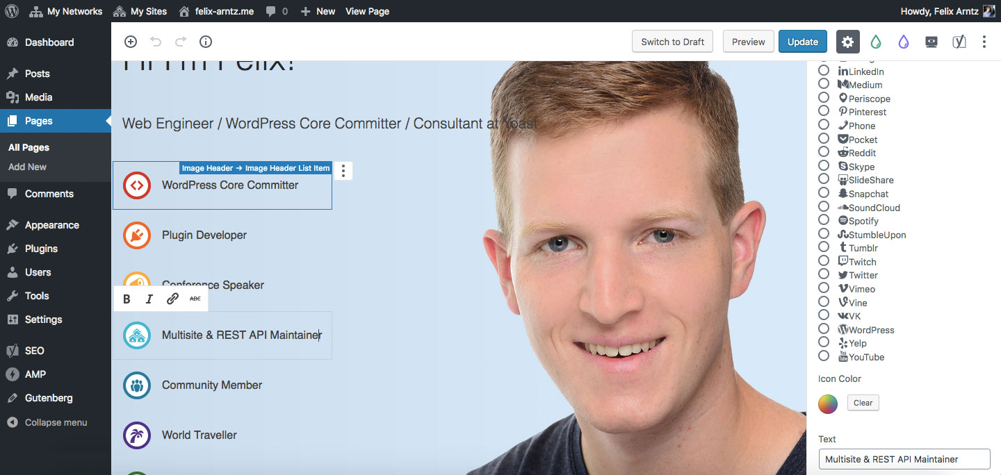
To take the most prominent example, the home page header uses a custom block type I called “Image Header”. It can be set to span the entire viewport width, you can set a background image, a title and a subtitle. You can also specify whether the content that overlays the background image should be displayed left-aligned, right-aligned or centered, which makes sense to be determined based on the image you provide. The block type furthermore supports nested blocks: The list of icons and their corresponding text in the image header are implemented using that technique, where each list item is a block of another very specific custom block type that can only be used as child of the “Image Header” block type. I implemented this restriction because the markup produced is an <li> tag, and you obviously want to make sure those only appear inside one of the valid parent tags (in this case <ul>). The block type that is used for the list items allows choosing an icon that is registered with the block editor from my site’s theme. You can also set the icon color and enter a text for the item.
I also created several other block types, for example a section that supports inner blocks with a couple of layout opportunities (you see this block type used throughout this entire website, check out all the full-width sections). All the data that is dynamic, for example latest posts, my projects fetched from GitHub or my WordPress plugins fetched from wordpress.org, is also displayed via custom block types, with those being rendered server-side.
Keep an eye out on my blog, as I will share more information, tutorials and code for the more universal ones of them in the coming weeks.
Canonical AMP
There is another exciting technology that has made its way around in the WordPress ecosystem for a few years already, but just recently became a lot more interesting again for wide adoption: The AMP open-source project has been prominent in the WordPress space since the initial release of the plugin of the same name, which has historically provided a duplicate instance of your website’s content as an AMP-compatible version. However, other than for news publishers, this approach was barely worth pursuing, since it essentially meant maintaining two different versions of the website. In recent months however, Google and XWP have collaborated on significantly enhancing the plugin’s capabilities, as the power of AMP and ease of applying crucial performance best practices should be available to more sites on the web. The upcoming release, of which my site currently runs a beta version, will allow site owners to leverage what is referred to as “Native AMP” (or “Canonical AMP”) – no need to maintain two versions, if you simply make your actual site AMP-compatible. I wanted to dive into it more, and that is what I’ve done: My website is now leveraging AMP.
The plugin already handles a whole lot for you: It transforms HTML tags and attributes to their AMP equivalents as necessary, uses an amazing tree-shaking feature to only include CSS that is actually relevant for the current page, and it notifies you of anything on your site that is not valid AMP. You still need to apply a few tweaks manually, for example any custom JavaScript functionality, for example the hamburger menu for handheld devices, has to either use AMP functionality or go. Which in many cases makes sense anyway, because often times you will find that you don’t actually need JavaScript to accomplish something for which you previously thought it was required. For example, toggling visibility of submenus in your navigation can now happen in pure CSS via the :focus-within selector – a few lines less JavaScript to load, a few less tweaks to make to get AMP-valid markup. The post on the XWP blog on how they made their website use AMP helped me a lot initially.
However, I didn’t stop there. There are a couple of neat AMP components that I thought would make sense to be used on my site:
- You might have noticed that posts don’t show the date when they were published, but a relative time such as “7 hours ago”. This is powered by the
amp-timeagocomponent, together with properly accounting for the timezone of the actual date so that the text is always accurate for the current time, from wherever you visit this site (did you know that it makes a lot more sense to rely onpost_date_gmtthan onpost_date?). - The horizontal list of projects that I have contributed to that you find on the homepage is powered by the
amp-carouselcomponent. - When you click the above image, you can see the
amp-image-lightboxcomponent in action. - You also find a cookie notice on my site, which uses the
amp-consentcomponent. Actually, this is not even something I built specifically for this site: It’s a plugin that is close to being ready for a wider audience, so I will very soon publish it in the wordpress.org plugin repository. You will hear about it shortly. - Even some of my custom Gutenberg blocks support AMP-specific markup. I wanted to ensure though that it all falls back gracefully, so nothing of what I built for this site actually requires AMP.
The same that applies to my Gutenberg integration also applies to implementing native AMP on my site: Over the coming weeks, I will share a bit more in-depth on how I took care of certain parts.
Performance and Accessibility
It may just sound natural that, when leveraging AMP, I also generally aimed for a solid performance throughout the site: Webfonts are served locally from the same server as this site and their @font-face declaration uses the font-display CSS property to fall back to a common font until the actual webfont is loaded. I furthermore added a couple of extra preconnect links to make the browser aware of third-party resources (such as my media CDN and the AMP runtime CDN). Icons are included in the markup as a single SVG which I can just reference whenever I need to display one.
Accessibility was just as important to me. The previous version of my site had several issues: Links weren’t underlined and had insufficient color contrast (shame on me for failing in both of these things), the main body font was way too thin, several images were missing alt attributes, most bits of dynamic content didn’t use the ARIA attributes they would have needed, and worse. This time I wanted to make it better. I think I’ve done a decent job and applied the things that I’m aware of, but since I’m not an accessibility expert at all, please let me know if you find something else that could be improved without an insane amount of work (that should not at all mean that these bigger improvements should not be implemented, but rather that I don’t have enough time to work on my website in order to for example add subtitles to embedded videos). If you make me aware of an accessibility issue on my site, I’ll do my best to fix it.
Next: Progressive Web App
There is also a PWA feature project for WordPress which aims adding progressive web app capabilities to WordPress. I have already started looking into using it on my website and even written some custom code to make its service workers being compatible with AMP and its amp-install-serviceworker component (soon, this will be possible without custom code though). The plugin is still in a very early stage, and the implementation is not entirely there so that I’ll use it here. With the next release, I will activate it though and let you know how it went.
So this is it, my new website. Feel free to browse around and take a look at the different things I implemented, maybe you already find a specific block type or AMP component that you would like to know more about its implementation.
I’m really really really really glad that I finally put time in improving my (before this change, ancient) website and learned tons of new things on the way. Additionally, in the process I have contributed to Gutenberg, the AMP plugin, the PWA plugin, and even to the AMP project itself, giving back to these projects that have enabled me to implement all the cool features here. And remember, it’s not over here, PWA is on its way!

Leave a Reply