
As I announced in my last post in which I explained how I updated my website using Gutenberg and AMP, I would like to share some more details on specific implementations for some of the block types and AMP support integrations. Let’s start today with looking into building a reusable Gutenberg section block type. What do I mean by this? It is common for websites to have their main content width limited to a maximum, to keep line lengths readable on larger screens. However, sometimes you still want certain components to break out of those limitations, or you might even want to break an entire page into different full-width sections which are differentiated by their visual appearance and allow to host content that itself is then again limited in its maximum width. The homepage of my website makes heavy use of this, if you prefer to see an example, or you can also look at the following example blocks embedded in this post. (Note that you will need a screen with a resolution of at least around 1200px width in order to see the width limits to take effect.)
This is a full-width section with alternate color, where the inner content width is limited to the maximum site content width (which is 72rem on my website).
This is a wide-width section with highlight color, where the inner content width is limited to the typical content width (I typically use 48rem).
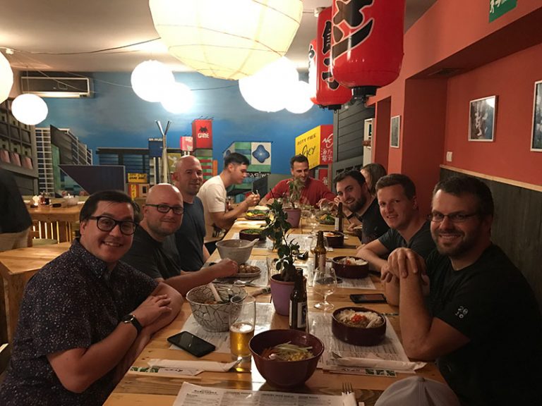
Of course you can put anything you like into a section, not only text – so here you see an image of a great dinner and conversations at WCEU with XWP and Multisite friends:
Oh, and sections can also have background images, which you can see showcased on my homepage.
The Section Component
Instead of having the block type control everything, I initially wanted to ensure to keep the section markup controlled separately from the actual block type that allows controlling them. Therefore I introduced a Section React component that is reusable and that I could theoretically also use in other block types and even entirely separate use-cases on my website. The component is stateless and rather simple, so here is the code for it:
import classnames from 'classnames';
import './style.scss';
function Section( { colorScheme, contentMaxWidth, className, children, ...props } ) {
	const wrapperClasses = classnames(
		'lal-blocks-section',
		{
			'is-style-alternate': colorScheme === 'alternate',
			'is-style-highlight': colorScheme === 'highlight',
		},
		className
	);
	const innerClasses = classnames(
		'lal-blocks-section-inner',
		`is-${ contentMaxWidth || 'site' }-width`,
	);
	return (
		<div
			className={ wrapperClasses }
			{ ...props }
		>
			<div
				className={ innerClasses }
			>
				{ children }
			</div>
		</div>
	);
}
export default Section;
Code language: JavaScript (javascript)
I’ll explain the code a bit:
- The markup consists of an outer
divthat is used to control the width and general appearance of the section. In addition, there is an innerdivto allow limiting the maximum width of the nested content. Thatdivthen actually hosts the content. - There are two major options for the component that you can pass in as props:
- The color scheme, for which I personally support three values “default”, “alternate” and “highlight” (for “default”, no extra CSS class is added).
- The maximum content width, which accepts an identifier such as “site”, which is then turned into an “is-site-width” CSS class on the inner
div. The CSS is then responsible for styling it.
- You can also pass in a custom class name for the section, which theoretically can be anything you like. Specifically for the block type, I will use this to pass in the
alignfulloralignwideclass (from default Gutenberg support) that will determine the width of the section itself. - Of course any markup to be included within the section can be passed as well (via the
childrenprop). - Last but not least, any additional props that you pass in will be interpreted as extra attributes for the section’s outer
div.
I include a style.scss file for the section component specifically, which Webpack will later extract out and generate a CSS file from it (look into Zac Gordon’s Gutenberg Course files and also the great course itself, if you want to learn more about how this works). In the CSS, I then provide styling for the classes, such as handling foreground and background colors depending on the color scheme class and the maximum width based on the content maximum width class. Since these are very theme-specific, the plugin that contains the block types for my website allows to disable the default stylesheet via add_theme_support( 'disable-felix-arntz-block-styles' ), which I actually make use of. Of course I wouldn’t have to do that, because the plugin is only used on my site anyway. But since I like to keep things reusable, I try to write most code as such.
The Section Block Type
Since we already looked at creating a component that takes care of the section markup, the block type is mostly responsible for the editor UI and the attributes available. The following attributes are needed:
- The
colorSchemeattribute is passed to theSectioncomponent as a prop directly. In order to control it in the editor, I use thewp.components.SelectControlcomponent for a dropdown, making the three options “default”, “alternate”, and “highlight” available. - The
contentMaxWidthattribute is passed to theSectioncomponent as a prop directly as well. It uses another dropdown with the options “content”, “site” and “full”. - Later during development, I decided to add support for background images too as mentioned before, so two attributes
attachmentIdandattachmentUrltake care of this. Using thewp.editor.MediaUploadcomponent, an image can be set. - You might wonder now how the width of the section itself is determined because there is no attribute for it. There is actually a super-cool integration in Gutenberg itself already that we can just use to make that happen: In the block type settings, you need to simply declare block type alignment support via
{ supports: { align: true } }. This will make the controls to set alignment appear automatically, and the respective CSS class will be added to the block-generated markup’s outer element. One extra detail: For the specific case of the section, I only wanted to allow wide alignment and full alignment, as left-/center-/right-aligned sections wouldn’t really make sense for my specific implementation. I accomplished this by changing the alignment support entry toalign: [ 'wide', 'full' ].
That’s pretty much it for the attributes and controls already. Before I explain the generated markup and further tweaks, I’d like you to get familiar with the entire block type first by looking at its code:
import classnames from 'classnames';
import BlockType from '../block-type';
import Section from '../../components/section';
const { Fragment } = wp.element;
const {
	PanelBody,
	SelectControl,
	BaseControl,
	IconButton,
} = wp.components;
const {
	InspectorControls,
	MediaUpload,
	InnerBlocks,
} = wp.editor;
const { __, _x } = wp.i18n;
export const name = 'felix-arntz/section';
export const settings = {
	title: __( 'Section', 'felix-arntz-blocks' ),
	description: __( 'Add a section that separates content, and put any other block into it.', 'felix-arntz-blocks' ),
	category: 'layout',
	icon: 'welcome-widgets-menus',
	keywords: [
		_x( 'section', 'keyword', 'felix-arntz-blocks' ),
		_x( 'separator', 'keyword', 'felix-arntz-blocks' ),
	],
	supports: {
		align: [ 'wide', 'full' ],
		anchor: true,
	},
	attributes: {
		colorScheme: {
			type: 'string',
			default: 'default',
		},
		contentMaxWidth: {
			type: 'string',
			default: 'site',
		},
		attachmentId: {
			type: 'number',
		},
		attachmentUrl: {
			type: 'string',
		},
	},
	edit: props => {
		const { attributes, setAttributes } = props;
		const { colorScheme, contentMaxWidth, attachmentId, attachmentUrl } = attributes;
		const onSelectImage = media => {
			if ( ! media || ! media.id || ! media.url ) {
				setAttributes( { attachmentId: undefined, attachmentUrl: undefined } );
				return;
			}
			setAttributes( { attachmentId: media.id, attachmentUrl: media.url } );
		};
		return (
			<Fragment>
				<InspectorControls>
					<PanelBody title={ __( 'Section Settings', 'felix-arntz-blocks' ) }>
						<SelectControl
							label={ __( 'Color Scheme', 'felix-arntz-blocks' ) }
							value={ colorScheme || 'default' }
							onChange={ value => setAttributes( { colorScheme: ( 'default' !== value ) ? value : undefined } ) }
							options={ [
								{ value: 'default', label: __( 'Default', 'felix-arntz-blocks' ) },
								{ value: 'alternate', label: __( 'Alternate', 'felix-arntz-blocks' ) },
								{ value: 'highlight', label: __( 'Highlight', 'felix-arntz-blocks' ) },
							] }
						/>
						<SelectControl
							label={ __( 'Maximum Content Width', 'felix-arntz-blocks' ) }
							value={ contentMaxWidth || 'site' }
							onChange={ value => setAttributes( { contentMaxWidth: ( 'site' !== value ) ? value : undefined } ) }
							options={ [
								{ value: 'content', label: __( 'Content Width', 'felix-arntz-blocks' ) },
								{ value: 'site', label: __( 'Site Width', 'felix-arntz-blocks' ) },
								{ value: 'full', label: __( 'Full Width', 'felix-arntz-blocks' ) },
							] }
						/>
						<BaseControl
							label={ __( 'Background Image', 'felix-arntz-blocks' ) }
						>
							<MediaUpload
								onSelect={ onSelectImage }
								type="image"
								value={ attachmentId }
								render={ ( { open } ) => (
									<IconButton
										icon="admin-media"
										onClick={ open }
									>
										{ attachmentId ? __( 'Edit Image', 'felix-arntz-blocks' ) : __( 'Add Image', 'felix-arntz-blocks' ) }
									</IconButton>
								) }
							/>
						</BaseControl>
					</PanelBody>
				</InspectorControls>
				<Section
					colorScheme={ colorScheme }
					contentMaxWidth={ contentMaxWidth }
					className={ classnames(
						attachmentId && `has-background-image-${ attachmentId }`
					) }
					style={ attachmentUrl ? { backgroundImage: `url('${ attachmentUrl }')` } : undefined }
				>
					<InnerBlocks />
				</Section>
			</Fragment>
		);
	},
	save: props => {
		const { attributes } = props;
		const { colorScheme, contentMaxWidth, attachmentId } = attributes;
		return (
			<Section
				colorScheme={ colorScheme }
				contentMaxWidth={ contentMaxWidth }
				className={ classnames(
					attachmentId && `has-background-image-${ attachmentId }`
				) }
			>
				<InnerBlocks.Content />
			</Section>
		);
	},
};
Code language: JavaScript (javascript)
As you can see, I used the Section component to render the block markup. You can already see the benefit of its reusability in action here: If we didn’t have the Section component, but had to manually generate the HTML markup, we would have to write a lot of similar code twice because the markup is generated both in the Gutenberg editor (via the edit() function) and for the actual post content (via the save() function).
To allow putting other block types inside of a section, I used the wp.editor.InnerBlocks component. Since I didn’t want to enforce any restrictions on which block types could be nested within a section, I simply use the component without passing any props.
Responsive Section Background Image
For the most important functionality of the block type, I think I’ve already explained everything important. Let’s now look at one major tweak I included, which affects how the background image is included. I could include it simply by passing a style prop to the Section component (which, if you remember, would then be interpreted as a style attribute on the section’s outer div). However, that would mean that the one image would be used as background regardless of the screen size. Since you most likely want the section to look good, you would choose an image size that works well with large screens, which would then mean lots of unnecessary overhead for smaller devices, and it would significantly decrease performance on phones with a 3G internet connection, just as an example. I wanted to find a way around that, to ensure a fitting image size is served based on the device.
As you can see, for the Gutenberg editor, I do include the attachment URL directly via style, since I wanted to keep things simple there and performance there is not as critical as in the frontend. However, when saving the post content, I add a CSS class has-background-image-${ attachmentId } instead, which contains the attachment ID. Without any further tweaks of course this would render without the background image showing up. Let’s look at how I used a server-side tweak to make it work.
By adding a filter on the_content, it is possible to check for occurrences of the above CSS class in the content. By matching them and extracting the attachment ID, we can dynamically generate CSS rules for each class, supporting media queries based on the image sizes that the respective attachment has. All rules generated are then eventually appended to the content in a style tag. While I could have theoretically done this in the block type code itself in JavaScript, this would have hardcoded the rather complex style tag for each block. Since the available image sizes might change and since a style tag shouldn’t preferably be part of a Gutenberg block type, I decided to use this more dynamic, server-side approach. Here you can see what my code for parsing the classes and generating a style tag from it looks like:
/**
 * Adds background image styles to any content elements using a `has-background-image-{$id}` class.
 *
 * This function uses all available image sizes to generate media queries, including taking
 * care of retina displays.
 *
 * @since 1.0.0
 *
 * @param string $content Post content.
 * @return string Filtered post content.
 */
function felix_arntz_blocks_enhance_background_image_style( $content ) {
	if ( ! preg_match_all( '/has-background-image-(\d+)/', $content, $matches, PREG_PATTERN_ORDER ) ) {
		return $content;
	}
	$styles = array();
	$attachment_ids = array_unique( array_map( 'absint', $matches[1] ) );
	foreach ( $attachment_ids as $attachment_id ) {
		$meta = wp_get_attachment_metadata( $attachment_id );
		if ( ! $meta ) {
			continue;
		}
		$attachment_url = wp_get_attachment_url( $attachment_id );
		$base_url       = str_replace( wp_basename( $attachment_url ), '', $attachment_url );
		if ( empty( $meta['sizes'] ) ) {
			$styles[] = "
	.has-background-image-{$attachment_id} {
		background-image: url('{$attachment_url}');
	}";
			continue;
		}
		$sizes = wp_list_sort( $meta['sizes'], 'width', 'ASC', true );
		if ( ! isset( $sizes['full'] ) ) {
			$sizes['full'] = array( 'url' => $attachment_url, 'width' => $meta['width'] );
		}
		$sizes = array_values( $sizes );
		$style            = array();
		$widths           = array();
		$min_width        = 0;
		$min_width_retina = 0;
		$size_count       = count( $sizes );
		foreach ( $sizes as $index => $size_meta ) {
			if ( $size_meta['width'] < 480 || in_array( $size_meta['width'], $widths, true ) ) {
				continue;
			}
			$widths[] = $size_meta['width'];
			if ( $index === $size_count - 1 ) {
				// Do not specify max-width for the largest available width.
				$max_width        = 0;
				$max_width_retina = 0;
			} else {
				$max_width        = $size_meta['width'];
				$max_width_retina = $size_meta['width'] / 2;
			}
			$media_query        = felix_arntz_blocks_get_media_query( $min_width, $max_width );
			$media_query_retina = felix_arntz_blocks_get_media_query_retina( $min_width_retina, $max_width_retina );
			$size_url = ! empty( $size_meta['url'] ) ? $size_meta['url'] : $base_url . $size_meta['file'];
			$style[] = "
	@media {$media_query} {
		.has-background-image-{$attachment_id} {
			background-image: url('{$size_url}');
		}
	}
	@media {$media_query_retina} {
		.has-background-image-{$attachment_id} {
			background-image: url('{$size_url}');
		}
	}";
			$min_width        = $max_width + 1;
			$min_width_retina = $max_width_retina + 1;
		}
		$styles[] = implode( '', $style );
	}
	$content = '<style type="text/css">' . implode( '', $styles ) . '</style>' . $content;
	return $content;
}
add_filter( 'the_content', __NAMESPACE__ . '\\felix_arntz_blocks_enhance_background_image_style', 100 );
/**
 * Gets a CSS media query string for the given minimum and maximum width.
 *
 * @since 1.0.0
 *
 * @param int $min_width Minimum width. If 0, it will not be considered.
 * @param int $max_width Maximum width. If 0, it will not be considered.
 * @return string Media query string.
 */
function felix_arntz_blocks_get_media_query( $min_width, $max_width ) {
	if ( $min_width && $max_width ) {
		return "screen and (min-width: {$min_width}px) and (max-width: {$max_width}px)";
	}
	if ( $min_width ) {
		return "screen and (min-width: {$min_width}px)";
	}
	if ( $max_width ) {
		return "screen and (max-width: {$max_width}px)";
	}
	return '';
}
/**
 * Gets a CSS media query string for retina displays for the given minimum and maximum width.
 *
 * @since 1.0.0
 *
 * @param int $min_width Minimum width. If 0, it will not be considered.
 * @param int $max_width Maximum width. If 0, it will not be considered.
 * @return string Media query string for retina displays.
 */
function felix_arntz_blocks_get_media_query_retina( $min_width, $max_width ) {
	if ( $min_width && $max_width ) {
		return "screen and (-webkit-min-device-pixel-ratio: 2) and (min-width: {$min_width}px) and (max-width: {$max_width}px),
		screen and (min-resolution: 192dpi) and (min-width: {$min_width}px) and (max-width: {$max_width}px),
		screen and (min-resolution: 2dppx) and (min-width: {$min_width}px) and (max-width: {$max_width}px)";
	}
	if ( $min_width ) {
		return "screen and (-webkit-min-device-pixel-ratio: 2) and (min-width: {$min_width}px),
		screen and (min-resolution: 192dpi) and (min-width: {$min_width}px),
		screen and (min-resolution: 2dppx) and (min-width: {$min_width}px)";
	}
	if ( $max_width ) {
		return "screen and (-webkit-min-device-pixel-ratio: 2) and (max-width: {$max_width}px),
		screen and (min-resolution: 192dpi) and (max-width: {$max_width}px),
		screen and (min-resolution: 2dppx) and (max-width: {$max_width}px)";
	}
	return '';
}Code language: PHP (php)
For each attachment found, the code get its available image sizes and includes media query-based rules for them, unless the respective size is smaller than 480 pixels, which I decided to use as the low boundary for media queries that make sense (you probably wouldn’t wanna have media queries such as screen and (min-width: 151px) and (max-width: 250px) because no common screen width would benefit from them). In addition to the regular media queries, I also include media queries for retina displays, using the image size divided by 2 as media query boundary.
As you can see in the code, it will take care of every occurrence of the has-background-image-${ attachmentId } class in the content, regardless of where it is used. This allows me to easily reuse this pattern in any other block type as well, and it also ensures the generated style tag works for all blocks in the content that have background images attached via that approach.
Since the code is a bit complex, take some time following it through. There might be things you’re wondering about, so please let me know if I should explain a bit more.
I hope this post gave you some inspiration for building custom Gutenberg block types and for approaching some of the challenges it might confront you with. I chose the section block type for this post because I think it is something typical that many websites could benefit from.
Please let me know if you have questions regarding the implementation that didn’t become obvious for you after reading the post. I’d also be happy to see your implementations of a section block – by sharing our approaches, we’ll be able to combine them to use the best parts from all of them!
Leave a Reply