
This is essentially a written version of the talk of the same name that I gave at WordCamp Europe 2019 (see the related slide deck).
As I’m sure we can all confirm, WordPress provides a strong toolset for creating awesome content. Particularly with the availability of the Gutenberg editor, publishers can now implement more interesting layouts and take their content quality to the next level. However, while the content itself is certainly the most important part of a website, there are a few other supporting pillars to ensure delightful content experiences for users consuming that content. Websites should be:


For more details on these four pillars, see the “Progressive WordPress Themes” talk by my colleagues Alberto Medina and Thierry Muller.
Unfortunately, satisfying each of these four requirements is anything but trivial. You might already know that just installing a performance or a security plugin is not actually going to magically solve these respective points.
Technologies and best practices on the web are constantly evolving: Regularly new APIs are introduced, new standards being established, former best practices being overruled. Add in all the popular frameworks that have come and gone over the years, and it becomes even more evident: Even the most senior rockstar full-stack developer cannot keep up with this technology complexity on their own.
In addition, even in the scope of a single website or application, maintaining a good overview of the different pieces can present a huge cognitive challenge. HTML, CSS, JavaScript, code for different areas shed across everywhere, with possible incompatibilities in functionality as well as in appearance with all thiese pieces being used in combination. This is what we can refer to as content complexity.
Fortunately, there are ways to reduce and work around both of these complexities. In this post we will look at a component-based approach and a relatively new technology called “Custom Elements” and how they address the aforementioned problems.
Components to the Rescue
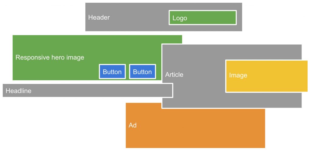
Rather than looking at a website as a whole, its scope can be broken down into individual components. This could be a header, a featured image, an image, or a button, just to name a few examples. These examples already show two important traits of components:
- They can be composed. For example, a “header” could include a “featured image” or a “button”.
- They can be extended. For example, a “featured image” could be a specific extension of a (generic) “image”.
Now imagine these components all working fully out of the box, bundling all necessary code themselves: All details on semantic meaning, appearance and functionality would be part of the individual component, and you could simply mix and match different components as necessary without the risk of running into conflicts.
Fortunately, this world partially already exists today: Many of the popular JavaScript frameworks, for example React, Vue, or Angular, are powered by such a component-based approach. The composability of components is typically implemented in that components can have child components, which feels very familiar to how regular HTML tags can be nested to become child nodes in the DOM. For the sake of this post, let’s separate components into two different groups:
- Components that actually render markup and UI elements are referred to as leaf components. Technically, not every one of them is a real leaf in the component tree (since for example a visual
Headercomponent could still include aButtoncomponent), but at least every one is very close to being an actual leaf, and many of them are actual leafs. - For the sake of simplicity, let’s label all other components parent components. There are many different levels of course, a component could be a grandparent component, or there is even a root component. In this post we’ll mostly look at leaf components though, so the other ones aren’t as important to categorize.
There are three crucial benefits to a component-based approach over a more traditional way:
- Reusability: Components can be used about anywhere and simply work because they are self-contained.
- Maintainability: The cognitive load is minimal because markup, style and interactivity are all located in the same place.
- Encapsulation: The chance for incompatibilities is drastically reduced by ensuring components can only be modified from the outside in predefined ways.
These crucial advantages justify why the majority of popular frameworks today rely on a component-based infrastructure – it is the way to go to reduce the content complexity to a minimum.
However, this leads to another problem: Almost every framework is implementing the foundation for components in a different way. Rarely can two different frameworks be used interchangeably, that’s why you hardly find a website that is using both React and Vue – today you have to make an opinionated choice which framework you prefer. This fragmentation causes issues in three fundamental areas:
- Lack of interoperability: Because the foundations between frameworks are different, you can only choose from a limited pool of components once you have decided on a framework to use. Imagine finding a Vue component for the UI piece you were looking for, but your application is using React – all you can do is re-implement that existing component from scratch in a React-compatible way.
- Reinventing the wheel: Having different foundations for a component-based architecture means that the developers of each framework basically reinvented the wheel. There are a lot of similarities, hence every framework is implemented in its own ways.
- Separated communities: While the large communities behind different frameworks typically look out for what the others are doing and occasionally apply learnings from the respective others, there is no actual collaboration in the long term. The communities are effectively just working side by side rather than together.
So how can this fragmentation be addressed? This is where “Custom Elements” come into play.
Web Components as a Component Standard
Custom Elements is one of a few new key web APIs that allow you to define your own HTML tags with custom meaning, styling, and functionality. This set of APIs is commonly referred to as Web Components. So what are Web Components?
Web Components are a standardized set of browser APIs that allow you to define your own HTML tags, reusable and self-contained.
Essentially, HTML elements can be seen as components, and by extending the set of available HTML elements, you get a component framework. Usage of components is very simple as they are just HTML tags, like for the built-in elements. The APIs encompassed by the Web Components umbrella are browser APIs, so custom elements just work natively and don’t need to be precompiled or transpiled in any way.
With Web Components, you get the same benefits you get from any component-based architecture, and even a little more in each dimension:
- They are more reusable, as they are represented by HTML tags, and HTML is the language of the web. Every framework eventually prints HTML tags, so they can also print the tags representing your custom elements. They work in any environment, whether JavaScript framework, plain JavaScript, or even just HTML.
- They are more maintainable, as you get to work with the native web APIs that have been around and evolving for decades, rather than needing to focus on alternative implementations. With Web Components, you get to apply best practices in semantic HTML as it has always existed.
- They are more encapsulated, as the encapsulation of components in framework implementations can be misleading: You could still tweak style or functionality of the output in any way with arbitrary CSS or JavaScript. Web Components introduce a new mechanism that actually allows scoped markup and styles, so that these are truly encapsulated and can’t just be modified with outside selectors unless that is intended by the component developer.
Last but not least, the most crucial advantage of Web Components is that they bring standardization into the fragmented world of components. Custom elements just work natively in the browser, so we can all start to follow a single canonical approach as a baseline, be compatible with each other, and share components in a myriad of ways.
Key Web APIs
As mentioned before, Custom Elements is only one of a few APIs that are summarized under the Web Components umbrella. Here is a more comprehensive list of these most crucial APIs:
- Custom Elements: The most important piece of Web Components which enables developers to define their own HTML elements.
- Shadow DOM: The crucial piece for true encapsulation, by allowing to scope the inner content of custom elements so that styles and functionality can only be defined internally unless explicitly exposed to the outside.
- HTML Templates: An auxiliary API which also helps in many other scenarios, but for the specific combination with the above two APIs can boost performance of parsing DOM content.
Quick note: As Custom Elements is the most crucial pillar of Web Components, the two terms are sometimes used interchangeably to denote the same thing. While that is not technically correct, it happens all the time (and might also happen in this post), so keep that in mind when chatting about the topic with other people.
Implementing a Custom Element
The Custom Elements API itself is fairly straightforward. The following code snippet indicates how the most basic pieces work.
class Tab extends HTMLElement {
    constructor() {
        super();
        this.attachShadow( { mode: 'open' } );
        this.shadowRoot.innerHTML = `
            <style>
                /* scoped styles */
            </style>
            <slot></slot>
        `;
    }

    static get observedAttributes() {
        // Return list of attributes to watch.
    }

    attributeChangedCallback( name, oldValue, newValue ) {
        // Run functionality when one of these attributes is changed.
    }

    connectedCallback() {
        // Run functionality when an instance of this element is inserted into the DOM.
    }

    disconnectedCallback() {
        // Run functionality when an instance of this element is removed from the DOM.
    }
}

customElements.define( 'my-tab', Tab );Code language: JavaScript (javascript)
A quick summary:
- Extend the
HTMLElementbase class (or one of the more specific classes for built-in elements, e.g.HTMLButtonElement). For more information, see this section on how elements can be extended. - Implement specific lifecycle methods, e.g.
connectedCallback()which is invoked when a new instance of the custom element is inserted into the DOM, e.g. to add event listeners. For more information, see this section on custom element lifecycle callbacks. - Add a shadow DOM to the element. In it you can specify styles scoped to the element and its shadow DOM children, as well as provide slots which would contain child elements from the light DOM. For more information, see this introduction to Shadow DOM.
- At the end, simply call the
customElements.define()method to register your custom element.
For a deep dive on how to implement custom elements, you should checkout the guides on developers.google.com, which include comprehensive lists of best practices.
While the API itself is fairly straightforward, keep in mind that you should really familiarize yourself on how to use semantic HTML and ARIA correctly before you start building custom elements. For example, if you implement a custom element as a button, you need to make sure it is interpreted as such. Adding event listeners in the custom element definition may get you the functionality you want, and adding styles may get its appearance right, but for machine-based interpreters of HTML your component will just be some unknown element. In order to give your custom element the correct semantic meaning, you could either extend the specific built-in element (which are internally implemented using similar mechanisms), provide applicable ARIA attributes on it, or compose a plain button element as an inner child. Ensuring proper semantics when building custom elements is essential:
- If you don’t get the semantics of your custom element right, it will harm accessibility and potentially SEO of your site and everybody else that’s using your custom element.
- If you do get the semantics of your custom element right, it will make it easier for you to follow these best practices in the future, and it will simplify it even for others since they can just reuse your custom element and don’t need to worry about the additional accessibility quirks themselves.
Although the Web Components APIs still feel relatively new and you may not have heard much of them before (which actually confirms how hard it is to keep up with the load of new web technologies), the specifications have been around for a while and are fairly well supported in modern browsers. All browsers except Internet Explorer support all three APIs in their current versions, and some have supported them for quite a while. If you need to support older browsers, you can fortunately use a polyfill for the custom elements specification. A little recommendation on the side: If you don’t intend to support browsers that lack Custom Elements support, you should actually look into support of other JavaScript features you are using – it’s very likely the same browser versions already support them too. So maybe you can even get rid of your Webpack and Babel build processes entirely.
Standardized Leaf Components
With there being a standardized set of APIs for implementing components, one may wonder what that means for all the frameworks implementing their own variants. What I would like to strongly emphasize is that they should not go away. The frameworks each have their own value, and they can’t even be compared to Web Components, as they are more than just component architectures – they are fully fledged application frameworks, while the Web Components APIs only cover that components part. However, something to pay much more attention to is how Web Components and application frameworks can work together and synergize each other.
As mentioned before, custom elements work pretty much anywhere since they are consumed just like built-in elements, with HTML tags. Frameworks like React render HTML, so they can also render custom elements by definition. Focusing on the specific example of React (because it’s the JavaScript framework of choice for WordPress), as of today there are a few limitations on how events from custom elements can be listened to in React components because of React’s Virtual DOM implementation, but the top down approach of rendering them just works out of the box. The React team is however considering improving interoperability so that you hopefully can use all the benefits of both React and Web Components in combination, a topic which my fellow Googler Paul Lewis talks more about in one of his videos. For a general overview of framework interoperability with custom elements, please refer to the “Custom Elements Everywhere” project.
Combining application frameworks with Web Components can become a powerful alliance in the future: Even with the current level of interoperability support, several frameworks could start adopting custom elements as the kind of leaf components mentioned earlier in this post. If all user-facing components used in major frameworks were implemented as custom elements, it would be much easier to find the right component for your use-case, there would be more collaboration between the different frameworks, and they would all share a common foundation, which would address much of the fragmentation problems outlined before. In an episode of the Software Engineering Daily podcast Malte Ubl, tech lead of the AMP project, stated in regards to frameworks that he is convinced that “we will see Web Components as the basically only technology used for what I would call leaf components”. The current development towards more interoperability between frameworks and Web Components hints at this becoming a reality in the future.
Applications of Custom Elements
Let’s focus on looking at a few projects and applications as examples for where custom elements are used or could come in handy.
The LitElement Base
While it is crucial that you become familiar with the native Custom Elements API first, once you feel comfortable it could be worth looking into frameworks that leverage the API under the hood. When you compare the Web Components APIs with building components in frameworks such as React or Vue, you may notice that the latter feel much easier. That is expected as Web Components are a set of standardized browser APIs which therefore need to be un-opinionated and verbose. Maybe compare it with jQuery: Vanilla JavaScript has traditionally been more verbose, hence everybody used jQuery – and while vanilla JS has improved, it actually still today is more verbose for some use-cases than jQuery, it’s just that the cost of using the framework is nowadays to high for the little benefits you get. Something similar applies to Web Components specifically: Their APIs are verbose, so it’s still worthwhile to use frameworks for rapid development – and of course there are some.
Highlighted here should be LitElement, which is a solid base class for developing fast and lightweight custom elements. It provides effective convenience abstractions and uses an HTML templating language that feels very similar to JSX which React developers might be familiar with – with the key difference that it uses tagged templates, another native web API, and therefore does not require any transpiling and can be used as-is. Whether you are coming to custom elements from a React background or not, LitElement is definitely worth a look.
The Gutenberg Editor
Custom Elements are by definition compatible with React, at least to some extent, so they can be used in combination already today, with React printing custom elements for the leaf components of the application. Of course this leads to the block editor Gutenberg and what use-cases would exist there.
There is a great analogy between custom elements and the block-based nature of the editor. Think about the rendered UI of every block being implemented as a custom element: This could pave the way for truly reusable markup that could be shared between the backend and the frontend. With React components, that would be challenging as it would require the frontend to use React which is rarely the case today for WordPress sites – but custom elements would simply work in both cases by enqueuing the encapsulated definitions of these elements in both the frontend and backend. Please let this thought sink in for a moment – this is true WYSIWYG by definition.
The other more general advantage given the standardized nature of custom elements would be that we as the WordPress community would benefit from the same common library of any custom element in the world we could be using. Instead of (re-)creating components and markup for the blocks we want, for many of them we could reuse custom elements someone else has built.
As a proof-of-concept, I have built a demo which implements the existing Latest Posts block in an alternative variant using custom elements. The example demonstrates how React and custom elements can complement each other in the context of Gutenberg, and as a little extra it uses a few other modern web APIs (including the aforementioned tagged templates) to showcase some more “future” best practices that are actually usable today already – there is no Webpack and no Babel to be found in the project, everything is browser-native. The demo should also act as an example for you to start experimenting with custom elements in Gutenberg. You can accomplish a lot with them today, and more might be coming: Following my session at WordCamp Europe I had a great conversation with Andrew Duthie, Gutenberg core developer, on potential improvements on interoperability and he pointed me to a pull-request where he had previously explored this. While the pull-request is currently closed, it was explicitly noted as something that could be continued at a later stage, so maybe we can iterate on his original ideas soon.
The AMP Framework
As the Web Components have actually been around for a while, there are several frameworks already using them. One of them is AMP, which is a Web Components framework focusing on user experience. The custom elements it provides are optimized for performance and have best practices built-in (for example, the amp-img tag which is built upon the built-in img tag includes features such as lazy-loading), and its supporting validation mechanism ensures that they are used correctly. Both of these traits support one of the framework’s main promises which is simplifying the creation of compelling user-first websites. By abstracting these best practices into easy-to-use custom elements, it also reduces the technology complexity mentioned in the beginning of this post.
AMP is also primarily an HTML framework. While it is written in JavaScript, most of its “AMP Components” are custom elements so that they can simply be used in HTML, and the framework includes several generic mechanisms to enable dynamic interactions in a declarative way. A lot of the things you would typically need to write custom JavaScript for otherwise AMP allows you to accomplish with HTML. That approach is partly built upon a virtue of custom elements themselves: While you need to know JavaScript in order to implement them, users that consume them only need to know HTML – which makes custom elements very appealing for mass adoption, as the amount of people familiar with HTML is certainly higher than the number of people familiar with JavaScript.
One of the major explorations on the project recently has been to embrace its Web Components nature further: Because AMP encompasses more features than only its custom elements which heavily interact with each other, it is currently not possible to use a specific custom element from the framework outside of a fully AMP compatible context. This also ties in with the current state of AMP compatibility being a binary experience – either your site is compatible or not. This path will however become more progressive in the future, as making AMP Components available outside of an AMP context is one of the top priorities going forward. For now these efforts are labelled “Bento AMP” (like a bento box). Whether you intend to transition to a fully AMP compatible experience or whether you just want to leverage the features and performance of specific components, Bento AMP will allow for an incremental adoption rather than a complete infrastructure change. With that, it will also aid AMP usage in WordPress and particularly Gutenberg: Because the block editor is not AMP compatible, it is impossible to use AMP’s actual custom elements in the backend today. In order to still provide Gutenberg blocks for them, the AMP plugin has to implement replacements for the editor view, which cannot fully replicate the elements’ real behavior and furthermore presents a maintenance burden. This will be entirely resolved by Bento AMP, as it will be possible to use the same custom elements in Gutenberg that the AMP framework would also use in the frontend – again an example of the true WYSIWYG experience mentioned earlier.
Start Building Custom Elements!
I hope that this post showcased some of the virtues of custom elements and the Web Components APIs to you, as I am convinced this will be a major part of the web of tomorrow. However custom elements are already widely used today, so I’d like to encourage you to learn more about them. Familiarize yourself with the APIs, start experimenting, deepen your knowledge in semantic HTML. Maybe you can leverage them already in your next client project, or possibly your next Gutenberg project – I’m curious to see what you will build with Web Components, and also how we can use these APIs in synergy with existing frameworks. Let’s combine them and embrace them for their individual strengths which can support each other.
Leave a Reply