
It’s been a while since I have posted on my blog. In fact almost 2 years now. But it’s been even longer since I have significantly touched the foundation of my website; other than the regular updates, adding a small plugin here or there, my website had been using the same infrastructure and theme since 2019. A lot of it even already existed the same way in 2018. My website had gotten really out of date, in terms of both content and technology. Some of the blocks I had implemented years ago were no longer working, so part of me was even afraid to open the block editor.
A few weeks ago, I finally decided to change that and modernize my website. But it didn’t just came out of nowhere. Specifically, I wanted to update my website to use a block theme. I had been excited about them since they were in the exploration stage already in 2019, pretty much as far back as when I was rebuilding my website, “the old way”. The opportunities for enhancing performance due to the new block theme paradigm seemed extremely promising to me.
Now that we’ve already had 3 major WordPress releases to establish and refine the new infrastructure, I decided to really give it a try. In this post I’ll share my experiences with you as well as the outcome and how it is impacting performance.
My goal
My goal for the project was simply to rebuild my website embracing the block theme paradigm – and through that hopefully improving performance as well. I didn’t want to make any major content updates, but give the whole site’s infrastructure a polish. Essentially, I was looking for a design where my existing building blocks would fit into as well.
Below you find a screenshot of my old website look. (I forgot to take a screenshot before updating, so the low-quality screenshot that WebPageTest took will have to do.) Compare that with the top of my new/current home page. The content is pretty similar, only the header bar has been notably updated (due to a new theme). But the overall experience isn’t that different.
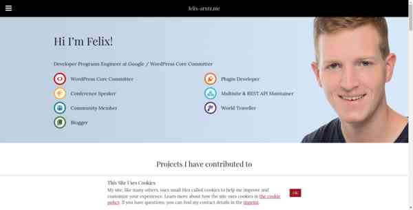
Keeping the same content structure, and even the same images, was important to me since part of my goal for this exercise was to compare performance before and after the update. And a fair performance comparison of my website powered by a classic theme and my website powered by a block theme is only possible if I keep most of the rest the same, so it does not skew the performance metrics. Anyway, we’ll get to the performance impact later. First I would like to go over my experience with rebuilding my website using a block theme. (If you don’t care about my process and want to jump straight into my performance conclusion, click here.)
Finding a theme
As a first step, I wanted to find a theme to use. In the past, I’ve been building the themes for my website sometimes from scratch, sometimes as a child theme with heavy modifications, but for the new block theme paradigm I decided I wanted to find something “from the shelf”.
Other than just randomly browsing the WordPress.org theme directory for block themes, I had already bookmarked a few specific block themes over the months before that had looked promising to me, or by developers who I knew were very much already embracing the new paradigm.
Unfortunately, my verdict after trying each one of them was not satisfying. With some of them, I immediately ran into some bug. Definitely a big no-go for a theme that I want to build my site on. If a theme has a bug that I run into within the first 5 minutes, it’s probably not (yet) stable enough. With other themes, I noticed they were still enqueuing a style.css file, sometimes many dozens of kilobytes. C’mon, that’s missing the point of a block theme. WordPress core now has this amazing functionality to have styles defined per block and via theme.json, and those styles being selectively included in the site only when they’re actually used. Maybe that was still useful a year ago, but at this point (and holistically) enqueuing a big ol’ style.css in a block theme seems backwards to me. Needless to say I ditched those themes right away. I was not looking for a hybrid, I was looking for a block theme. A real block theme.
After some frustrating experiences, I decided to just take a step back and give Twenty Twenty-Three (or short “TT3”) a try. I had never used a WordPress default theme for my personal site before. Normally the WordPress default themes would offer too few customization options and there would be way too many things in them that I would want to customize but couldn’t without overriding a ton of templates and functions in a child theme, or sometimes not even with that. However I was thinking that with the flexibility that full site editing provides that should not be as much of an issue when using a WordPress default theme that was also a block theme. And additionally, one thing that can certainly be said about the default themes is that for many things they are the prime examples on how you should build a theme, properly using the tools and APIs that WordPress core offers. I was right away pleased to see that TT3 only had its style.css to include the mandatory theme header, not actually using that file. Finally! It didn’t take me more than 15 minutes to decide to roll with it.
First theme customizations
I am not a designer, you may know that about me. I like to think that, for a developer, I have some idea of design, but chances are you’ll find some things in my site which you consider bad UX or just hella ugly. That’s okay. Feel free to share them with me, or examples for how to do it better, I’m all ears.
Anyway, the reason I mention that is just to highlight that I also didn’t have a particular design requirement for my theme. As mentioned before, my goal for the new website was essentially to rebuild my previous site, pretty much with the same content that there was before, including the home page, but I was flexible to change the style as long as it remained that somewhat plain and simple overall feel, lots of black and white.
For the next few paragraphs, you may want to open my home page in a separate tab, in case you want to visually better understand what kind of changes I am describing here.
First, I wanted to update the theme’s color palette to make use of the dark red tone that I had been using for years. And I wanted to use it for links as the bare minimum. For what it’s worth, I’m personally not a fan of those black links within black text that TT3 has by default. Underlining links is more crucial for accessibility than a different color, but what works best is to have both. I wanted the links to stand out more which I could easily do by having them use my dark red tone as color. So I went into the Site Editor and opened the “Styles” sidebar to first update the color palette, then the link color. That’s how easy it was to give TT3 my initial little personal touch.
The first more specific change I wanted to make was to update the font family used for headings. I had seen a heading font family in another one of the themes that I had tested that I had liked a lot, so I went with that. In order to introduce a completely new font family, I had to create a child theme – which, just to be clear, I had already expected would be necessary at least for some of the stuff. So I quickly created my child theme, included a theme.json file, in which for now all I did was setting the settings.typography.fontFamilies property, in order to override that of the original TT3 parent theme. Worked like a charm! As soon as I had saved the file, I went into the Site Editor, to Global Styles, and my new font family was available as one of the options. So I updated the global heading typography style to use that font family. Done.
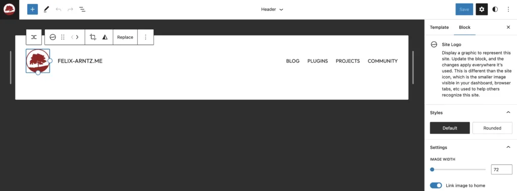
The second change I made was to update the header template part, by editing it directly in the Site Editor. I wanted to show my site’s logo next to the title, so I went ahead and wrapped the existing core/site-title block in a core/group block, transformed it to a “Row” so that the inner blocks are distributed horizontally rather than vertically, and then added a core/site-logo block within, before the core/site-title block. That immediately looked like I envisioned. I also changed the font style for both the site title and the navigation menu to use the same font family as the headings. And I changed them to be all uppercase, I thought it looked nice for those particular use-cases.
I then also changed the footer template part. The default experience for TT3 was to only have the copyright and “Powered by WordPress” notes, but I wanted to have something more like that “classic” footer widgets section, so I added three columns above and put some blocks into them, with the same content I had used on my website prior. The only thing I added to the widgets that weren’t there before were the social links, using the core/social-links block. The reason I made that change is that my previous design had those within the slide-in navigation on the left, but TT3 doesn’t have that, and I didn’t want to get into the hassle of trying to accomplish that. Frankly, that’s one of the specific things that I’m not sure yet how feasible it is with block themes at this point. But anyway, having them in the footer works well, arguably even better as they now have more visibility and directly follow the main content of the page. Oh, and last but not least, I also added my personal “Daily Movie Quote” block which I’ve had on my site probably for almost 10 years at this point. It used to be a widget, and now it’s a block. 🙂
A (not so quick) detour: Modernizing my custom block types
You may notice when looking at my home page and some of the other pages that I’m using a lot of custom content, which I had developed custom block types for already in the past – like I said, long time ago, most in 2018.
By far the most time that I spent on reworking my website actually went into modernizing those block types, or rather creating entirely new versions of them. The old versions of them weren’t even using React hooks yet, let alone have block.json files and follow the other latest conventions. I’m not going to go into detail for that work since it’s not really part of migrating to a block theme. Just in my case, since it had been so long that I had worked on my website blocks, I also wanted to clear up that mess. Now, all my blocks function again, and their UX is also better than before (even when they were functioning).
Most of my custom block types are actually used outside of the home page, and they are “dynamic” block types that rely on server-side logic for rendering, since they dynamically display API data from WordPress.org and GitHub. For reference, here is a list of all custom dynamic block types I have developed for my site:
- “Plugin Cards”, to show cards with my WordPress plugins or other WordPress plugins I have contributed to (as seen on my Plugins page)
- “GitHub Cards”, to show cards with my GitHub projects or other GitHub projects I have contributed to (as seen on my Projects page)
- “Speaking List”, to show my talks given at past conferences (as seen on my Community page)
- “Event List”, to show events such as WordCamps that I have attended or will attend (as seen on my Community page)
- “Featured Event”, to highlight a single upcoming event (as seen in the footer of my site)
- “Post Cards”, to show cards with my latest blog posts (as seen on my home page)
- I could have made those more dynamic and integrate with
WP_Querylike the actual new post and query blocks, but for simplicity sake and since I wanted to just use the same approach as for my “Plugin Cards” and “GitHub Cards” blocks I went with a more basic solution where it is all encapsulated in the block instead of using block context.
- I could have made those more dynamic and integrate with
- “Latest Props”, to list latest WordPress core commits I was involved in (as seen in the footer of my site)
- “Daily Movie Quote”, to display a daily updated quote from a curated list of movie quotes (as seen in the footer of my site)
- “Copyright”, to simply show a text containing copyright icon, site title, and the current year, also optionally supporting a start year (as seen at the very bottom of my site)
I also implemented a few more traditional block types – which are always a bit more work but also usually end up with a way smoother user experience. Those are:
- “Project Icons”, to display icons of projects I have been working on (as seen on my home page); this block is essentially a wrapper using
InnerBlockswithcore/imageblocks within, but a few parameters can be centrally controlled through it - “Icon List” and “Icon List Item”, which work together to display a list where every list item has an icon before its main content (as seen in the header of my home page);
- I’m thinking that one I might publish as a plugin at some point.
- There is already an excellent Icon Block plugin by Nick Diego out there, but my use-case is a bit more specific and the approach a little different.
- UX for my block type is not where I want it to be, but maybe I can polish it at some point.
- The screenshot below gives an idea what that that block type looks like. Note that I have added block-specific styles in my theme to make them look like the profile badges on WordPress.org, that style is not the default experience for the block type.
Okay, enough for this detour around block types. Let’s get back to modernizing my site with the block theme.
Putting together the main pages
As mentioned above, most of my time ended up going into reworking the block types that I had last touched years ago. Once I had them, rebuilding my main pages (all of which already existed with similar content in the previous version of my website) was a breeze. The block editor truly has come such a long way! I remember how when I built the same layout in 2018, I was required to implement custom block types for the most basic things (e.g. I used to have a “section” block type), whereas now all my custom block types (except maybe the “Copyright” one) truly only exist for very specific purposes that WordPress core should definitely not cover out of the box. I was specifically impressed how far the core/cover block has come, as it was able to satisfy all my needs perfectly (even the focal point selection, which is amazing!).
There were just two small quirks that I ran into:
- The
core/separatorblock for some reason was showing at 100px width in the block editor, whereas on the frontend it would span the content width. Turns out that bug has since been fixed and will be gone with WordPress 6.2. - When using the
core/groupblock aligned to cover the full width of the viewport (which I am doing in a few places on my home page), I noticed that there was no padding on the inner content, even though thecore/groupblock element had the correcthas-global-paddingclass applied. I opened a Gutenberg GitHub issue for that. As a temporary workaround, I added afunctions.phpto my TT3 child theme and included the following code to fix it with some extra CSS:
function twentytwentythree_felixarntz_fix_alignfull_padding() {
	$extra_css  = '.has-global-padding > .alignfull.has-global-padding {';
	$extra_css .= 'padding-right: var(--wp--style--root--padding-right);';
	$extra_css .= 'padding-left: var(--wp--style--root--padding-left);';
	$extra_css .= '}';

	wp_add_inline_style( 'global-styles', $extra_css );
}
add_action( 'wp_enqueue_scripts', 'twentytwentythree_felixarntz_fix_alignfull_padding', 1000 );Code language: PHP (php)
Tweaking the child theme styles
With all my content ready for prime time, there were still a few visual tweaks I wanted to make. Since I already had created a child theme for TT3 early on, I was well set up for that.
One thing that came to mind as soon as I thought about further changes to cover in my theme.json was to migrate my custom-made Site Editor tweak from before directly into my theme. That is not strictly necessary, but I like to manage the structure, layout, and design of my site primarily via code. Having the opportunity to have those changes stored directly in the database is certainly great, but I prefer to have it more centrally controlled by code from my site’s GitHub repository. Additionally, I also have different environments for my site, such as a staging environment, and it’s much more straightforward to just deploy the latest code there and have the layout and design changes apply, rather than having to migrate databases or manually making the changes in the Site Editor again. So I went ahead and brought over the global style changes I hade made before (see First theme customizations section) into my theme.json:
- For my customized color palette, I set the
settings.color.paletteproperty to override the default TT3 palette – again, most importantly to set my dark red tone as “primary” color. - To have the general link color use my new “primary” color, I set the
styles.elements.link.color.textproperty tovar(--wp--preset--color--primary), so that it references the automatically available CSS custom property based on my “primary” color from mysettings.color.palettelist. I also updated the several more specific link styles like “:hover”, “:active”, etc. accordingly, withinstyles.elements.link. - To update the general heading font family to the new font family I had added to my
theme.jsoninitially, I set thestyles.elements.heading.typography.fontFamilyproperty to the automatically available CSS custom property referencing the font family from mysettings.typography.fontFamilieslist. - Since I had also tweaked the
core/site-titleandcore/navigationtypography specifically, to bring those changes to mytheme.json, I set thestyles.blocks[ 'core/site-title' ]andstyles.blocks[ 'core/navigation' ]properties in the same way. For both of them I tweaked theirtypograph.fontFamilyaccordingly, and I set theirtypography.textTransformto “uppercase”. Last but not least, I didn’t like that they were also using the regular dark red link color, so I wanted to reset those particular blocks to the regular black color, since essentially all text in them are links. I did so by setting theirelements.link.color.textproperties to “inherit”.
As I was reviewing the look of my in-progress site, I also decided to change the button appearance, to use my dark red tone as background color. Since I was already using theme.json at this point for styling, I made that change right there, by setting styles.elements.button.color.background to var(--wp--preset--color--primary) and styles.elements.button.color.text to var(--wp--preset--color--base). Similar to the links, I also updated the more specific “:hover”, “:active”, etc. styles accordingly.
Last but not least, one more specific part of my site where I wanted to tweak the style was my custom block type for the “Daily Movie Quote”. Since I custom-developed this block type for my site, of course I could have just gone into the block type’s own stylesheet and make those changes, but the changes I wanted to make here really were theme-specific, and for proper separation of concerns I wanted to do things the right way. (On that note, please keep in mind that your block type styles should be as unopinionated as possible. If you want to include opinionated base styles (including things like color, typography etc.) with your block type, do that in an optional “theme” block type stylesheet, separate from the main block type stylesheet.) Since I wanted to update the styles of this block type specifically for my theme, I added an entry styles.blocks[ 'daily-quote/daily-quote' ] to my theme.json. I added modifications for its border, typography, and spacing properties, and I also wanted to specifically change the typography of the cite element in the block (i.e. the “source” of the quote), so I set styles.blocks[ 'daily-quote/daily-quote' ].elements.cite accordingly. However, for some reason, the styles I added there were not showing up.
It took me some time to investigate and figure out what was going on there. Turns out this is a very specific problem in the WordPress core function wp_add_global_styles_for_blocks(), which leads to element-specific styles within custom block styles in theme.json being ignored. I opened a WordPress Core Trac ticket for this bug and started working on a pull request to fix it. Since for my specific site, this “Daily Movie Quote” block is the only place where I am displaying a cite element anyway, I simply went with the temporary workaround to apply that styling globally to any cite element, by setting styles.elements.cite accordingly.
That’s the gist of what I customized in my child theme’s theme.json. If you’re interested in seeing the full result, I’ve put it in a GitHub Gist. See what I did there? 😏
Tweaking the child theme templates
For the theme’s templates, I was generally quite happy with what TT3 provided out of the box. There was only one thing that I wanted to change right away which is that specifically for my static front page I didn’t want the title “Home” to show as it would just look odd given my heavily customized page content there, and such a title would be redundant to show anyway. I also wanted to remove the margin between the main content and the header since that big cover block with additional spacing above would have made the header look uneven. All that was quickly done by adding a new templates/front-page.html file to my child theme, to target just that one page specifically. Here is all I added to it:
<!-- wp:template-part {"slug":"header","tagName":"header"} /-->

<!-- wp:group {"tagName":"main","style":{"spacing":{"margin":{"top":"0px"}}}} -->
<main class="wp-block-group" style="margin-top:0px">
	<!-- wp:post-content {"layout":{"type":"constrained"}} /-->
</main>
<!-- /wp:group -->

<!-- wp:template-part {"slug":"footer","tagName":"footer"} /-->Code language: HTML, XML (xml)
The last step to finalize my child theme was to go over various content on my local development site that showcases the different templates and review if I wanted to make any further changes.
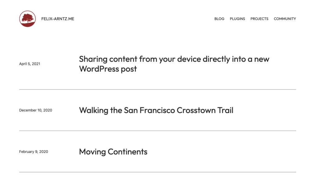
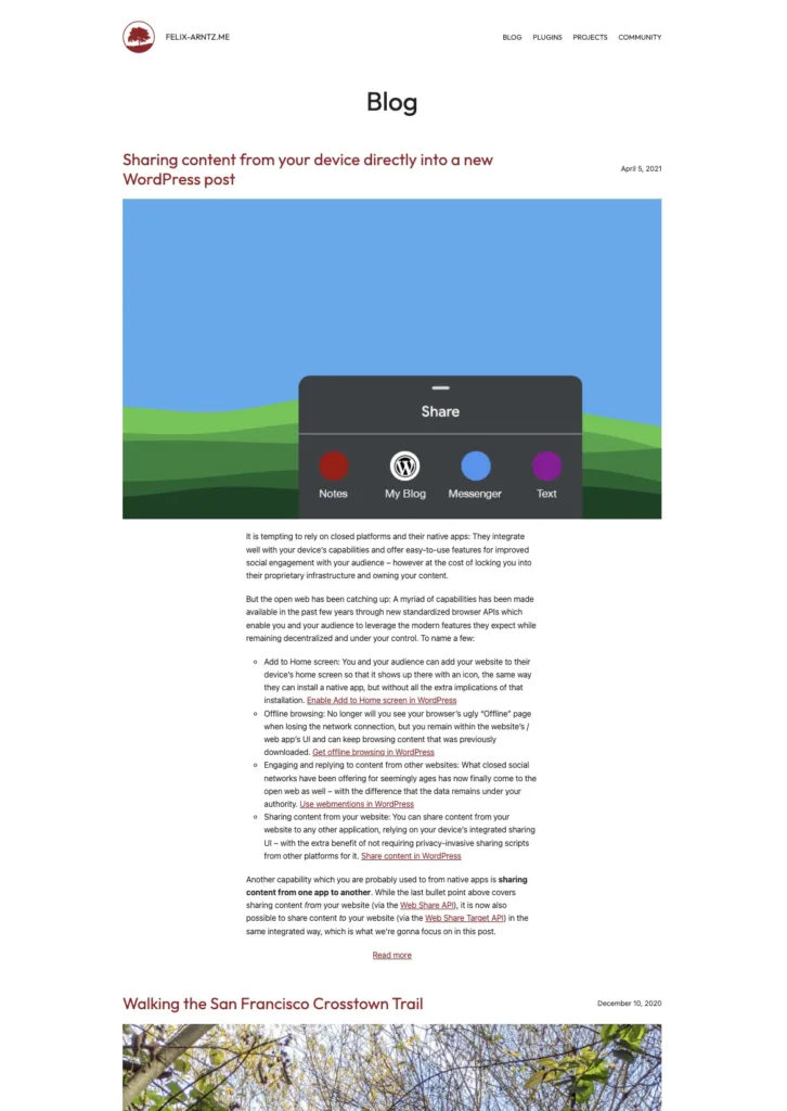
The one template that I wanted to heavily modify is the regular blog template. TT3 by default uses a grid of posts, which may work well for some, but I wanted a more classical blog appearance. I also always make use of the <!-- more --> tag in my blog posts, which allows me to customize which part of the post is visible in archives. I personally much prefer that over an automatically generated “excerpt” which just cuts off content randomly and also doesn’t allow for anything more appealing than plain text. The drawback is that customizing the “cutoff” point for content manually like that is that the length may differ between posts, which makes this approach less feasible for a grid layout of posts – obviously I wouldn’t want one of the post cards to be way longer than another one for example. Anyway, even though I ended up changing that templates/home.html template entirely, after all I still took inspiration from another template that TT3 provides, which is its “Blog Alternative” template”. That template only includes post titles and dates, so it wasn’t good for me to use as is, but I liked the idea of showing the post date in the same row as the title in a similar style that it did. So I took that idea and combined it with my more traditional blog style. That may sound a bit out of context without a visual reference, so you can see in the screenshots below what I mean.
After finalizing my templates/home.html template, I also updated the other templates responsible for listing posts for consistency. Those were archive.html, index.html, and search.html. Essentially they now look the same, except for small tweaks like of course showing the correct heading on the archive or search results templates using the core/query-title block.
My workflow for making those tweaks ended up going through the Site Editor first, then copying the changes made into an HTML template file in my child theme’s templates folder and cleaning them up as needed. When I say “clean up”, I mostly mean indenting the HTML elements and block comments in a way that they are easier to read. The only other clean up I can think of was that for some reason all usages of the core/query block included a queryId attribute in its block comment, which I’m not sure what it is for, but it doesn’t seem necessary for the template (for example, the original TT3 template files don’t include it either). So I removed that attribute from all core/query blocks in my child theme templates as well.
And with that, my website redesign was done! I was ready to deploy it to my staging site and then production site – almost. I was eager to see the performance impact, so in order to compare it with the previous version of my site, I first needed to measure performance of that before finally saying goodbye to it forever. 🙂
Comparing performance
A brief excursion into measuring web performance
Measuring and benchmarking performance is not trivial. With all the tools available, one may think running Lighthouse or PageSpeed Insights over your site will give you a solid idea on its performance. That is not the case! At least not without certain caveats to consider.
When you use tools like the aforementioned, they load your website once and based on that record performance metrics. What this does not account for is that several of these metrics, especially those related to load time, can vary greatly between requests even to the same site. How fast a site loads depends on so many factors, including how fast your own network connection is, how busy your machine is, how the tool you use requests the URL, etc. All that varies, even between 2 runs within just a few minutes. This means that, if you make a change that is supposed to enhance performance and then test your site before and after with just a single run of e.g. PageSpeed Insights, even if the “after” result looks better, it may not mean anything – it could just be random.
To get a better idea about performance changes, you need to measure performance multiple times. A great tool that makes that a bit easier is WebPageTest, as it allows to make up to 9 requests to the given URL within a single test triggered. It can even make sense to go beyond that number though. I used multiple tests with WebPageTest to make 36 requests to my home page in total, both for the previous version of my website, which was using a classic theme, and for the new version, after I deployed my new block theme setup. That way I could calculate a median from the 36 requests for each metric and compare it with the respective median from the other 36 requests.
Another thing to consider for performance measurement is the viewport of the device accessing the website. To at least get a rough idea that goes beyond just one uniform viewport, I decided to go with one configuration that represents a “desktop” like experience and another configuration that represents a “mobile” like experience, again using 36 requests for each of these scenarios. Considering the above, I would need 36×4=144 requests to my home page in total to complete the performance assessment. Note that I only tested performance of my home page. I could of course have expanded and tested certain other types of content on my site as well, but that would have been more effort that for this particular purpose didn’t seem necessary.
I’m not going to go into more detail on how I exactly measured performance for my site update, as that would make this already long article even longer. I am however planning to write a separate post on how I gathered these metrics and how you can use a similar methodology to measure performance in your WordPress site, theme, or plugin. If you are interested in that and have specific questions you would like answered, please let me know in a comment! That way I can take it into account when writing the follow up post on performance measurement.
Performance analysis and results
I was most interested in comparing the load time metrics, “Largest Contentful Paint” (LCP) (which is one of the Core Web Vitals) being the most important one. “Time to First Byte” (TTFB) and “First Contentful Paint” (FCP) are also interesting to look at, however it should be noted that they are part of LCP anyway and are useful for more in-depth review.
Since TTFB measures the server response time and is part of LCP, I also wanted to measure for every request the difference between the two (i.e. “LCP – TTFB”) as that would give a better idea on the performance changes that can be attributed purely to client-side modifications.
I also measured “Cumulative Layout Shift” (CLS) (also one of the Core Web Vitals) just out of curiosity. “First Input Delay” (FID) is not covered, partly because it is usually very good for WordPress sites anyway, but more importantly because it simply cannot be measured with an on-demand lab test.
Last but not least, I also measured two supplemental things which don’t typically vary between requests, which are the number of DOM elements and the total bytes of data that my site consumes with a page load – both of those just as yet another data point to compare.
Here is a summary of the median results for each metric for my “desktop” test:
| Metric | Before (classic theme) | After (block theme) | Difference in % |
|---|---|---|---|
| TTFB | 150ms | 151ms | +0.67% |
| FCP | 603.5ms | 330.5ms | -45.24% |
| LCP | 855ms | 548.5ms | -35.85% |
| LCP – TTFB | 703ms | 394ms | -43.95% |
| CLS | 0 | 0 | 0% |
| DOM Elements | 714 | 511 | -28.43% |
| Total Bytes | 1060151 | 970814 | -8.43% |
As you can see, the wins are massive! For what it’s worth, my site was not slow before. It runs on a fast host and I was using AMP to enforce certain performance best practices. But even AMP can only enforce so much. The improvements here that come from using a block theme are impressive, with for example LCP 36% faster – which effectively means that my site loads 36% faster than before.
As you can see, TTFB is roughly the same. Don’t get fooled by the “decrease” in performance on that metric. That 1ms difference is really too small to be meaningful, it’s likely just random, overall that metric remains stable. The reason for that is not, as one may think, that TTFB with block themes is exactly the same as without; it’s simply because my site is using a full page cache. 🙂 A response time of 150ms is quite fast for this setup. If my site wasn’t using a full page cache, you would see a difference in this metric between the two versions of my site, but anyway it means that you can effectively ignore this metric for the comparison. It should be noted that TTFB is typically worse for block themes than for classic themes, simply because they have to handle a lot more logic to render the page. It has notably improved for the upcoming WordPress 6.2 release, but is still not on par with classic themes TTFB. The major benefits of block themes for client-side performance easily make up for that though – even more for sites that use a full page cache, like mine. Always remember: You can work around slow TTFB with a full page cache, but you still have to consider client-side performance. And that is where block themes clearly shine. The LCP – TTFB comparison highlights that performance of my site is now 44% faster client-side.
For my “mobile” comparison, the median results show lower percentages which is expected, but the absolute difference aren’t any less impressive and show a clear advantage in performance now that I’m using a block theme. Here is a summary of the median results for each metric for my “mobile” test:
| Metric | Before (classic theme) | After (block theme) | Difference in % |
|---|---|---|---|
| TTFB | 700ms | 700ms | 0% |
| FCP | 1596.5ms | 1003.5ms | -37.14% |
| LCP | 1778.5ms | 1376.5ms | -22.60% |
| LCP – TTFB | 1076.5ms | 674ms | -37.39% |
| CLS | 0 | 0 | 0% |
| DOM Elements | 706 | 511 | -27.62% |
| Total Bytes | 892777 | 418101 | -53.17% |
It’s also worth noting how the total bytes my site loads are less now, which is good for saving bandwidth and partially correlates with the load time improvement.
While this performance data doesn’t exactly tell us why performance of my site is now so much faster than before, some of the reasons are evident just by understanding how block themes work. Some of the aspects to highlight are:
- Block themes generate the entire output into a string before actually printing it. That allows to reliably discover which content is actually used on the page and thus to selectively load certain assets like stylesheets and scripts only if they are actually used on the page.
- Blocks encourage encapsulation and separation of concerns, for example creating a stylesheet specifically per block. This facilitates the selective loading of assets above. The same applies to scripts: Rather than loading a single script across all the site, it is now easier and more feasible than before to load scripts only as contextually needed.
- Block themes are built with the above paradigm in mind, with
theme.jsondeclaratively providing additional styles that are only loaded if the respective content is used on the page. No longer having to load a massivestyle.cssfile across the entire website is probably one of the most notable wins for blocks and block themes. - The benefits for all of the above just become better as block themes fully rely on blocks for their HTML markup. That way all content is subject to the above performance features.
For my site specifically, it should be noted that, since my old site was using the AMP plugin, it was using CSS tree-shaking, which meant that any CSS not used on the page would be automatically stripped. That approach is no longer feasible now as the site is no longer using AMP, so when you look closer at the WebPageTest results (compare e.g. this result from before with this result after the change), you will see that my site now in fact ships a bit more CSS to the browser than before. Which make the wins here even more impressive – keep in mind that, unless you’re using a technology like AMP that makes the HTML markup predictable, you won’t realistically be able to use tree-shaking reliably either. If you then switch from a classic theme to a block theme, the amount of CSS loaded is expected to go down. I was a bit baffled to see 28 KB of CSS being loaded (continue reading if you want to find out why it was that much CSS). At least, even with all that CSS, you can still see in the WebPageTest data that by using a block theme, the amount of JavaScript and even HTML (also see the “DOM Elements” metric in the tables above) has drastically gone down.
All in all, at this point it was already fair to say that switching to a block theme was worth it from a performance perspective. But I wanted to see if I could take things a bit further.
Further performance enhancements
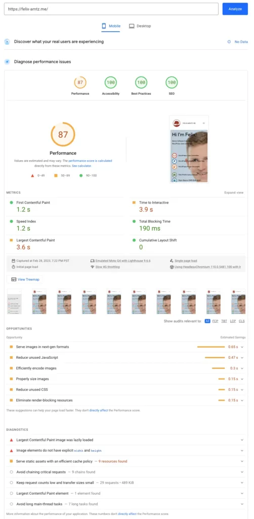
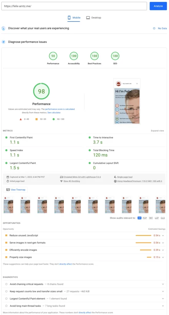
While I mentioned earlier that running PageSpeed Insights (PSI) on your site once is not going to give you accurate performance metrics, what it does give you even from a single run is useful recommendations on additional performance tweaks you can potentially make. So in addition to measuring performance of my site before and after with WebPageTest, I also wanted to see what PageSpeed Insights would tell me about my site after switching it to my TT3 child theme setup. Potentially there are some good recommendations that I can implement to get even more performance out of my site.
And there were some useful recommendations indeed which I acted on. Let’s go over them one by one.
LCP image lazy-loaded
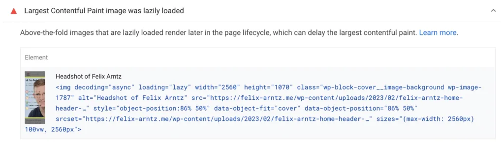
Most prominently, PSI complained that my LCP image was being lazy-loaded. This is in fact a known bug with block themes in WordPress core which I recently committed a fix for. In other words, this problem will go away as soon as WordPress 6.2 is released and my site is updated to it.
For now, I implemented a temporary workaround in my theme’s functions.php file. I’m sharing the code for it below. What it effectively does is ensure that the very first image with the class wp-block-cover__image-background on the “front page” template gets its loading="lazy" attribute removed.
/**
 * Fix first content image from being lazy-loaded.
 *
 * This fix should no longer be needed once WordPress 6.2 is released.
 *
 * @param string      $image   The image tag.
 * @param string|bool $context The context of the content that the image is being parsed as part of.
 * @return string Potentially modified image tag.
 */
function twentytwentythree_felixarntz_fix_lazyloaded_lcp_image_on_front_page( $image, $context ) {
	static $lazy_load_removed = false;

	// Return early if lazy-loading attribute was already removed in this request.
	if ( $lazy_load_removed ) {
		return $image;
	}

	// For full block template, no context value was set until WordPress 6.2.
	if ( $context ) {
		return $image;
	}

	// Only consider front page images.
	if ( ! is_front_page() ) {
		return $image;
	}

	// Only consider cover block background images.
	if ( ! str_contains( $image, 'wp-block-cover__image-background' ) ) {
		return $image;
	}

	// If that image is lazy-loaded, fix it.
	if ( str_contains( $image, ' loading="lazy"' ) ) {
		$image             = str_replace( ' loading="lazy"', '', $image );
		$lazy_load_removed = true;
	}

	return $image;
}
add_filter( 'wp_content_img_tag', 'twentytwentythree_felixarntz_fix_lazyloaded_lcp_image_on_front_page', 10, 2 );Code language: PHP (php)
Unused render-blocking CSS
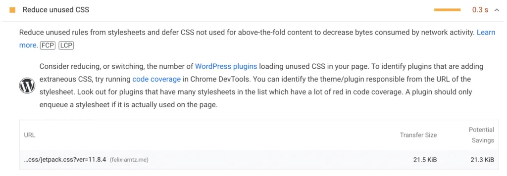
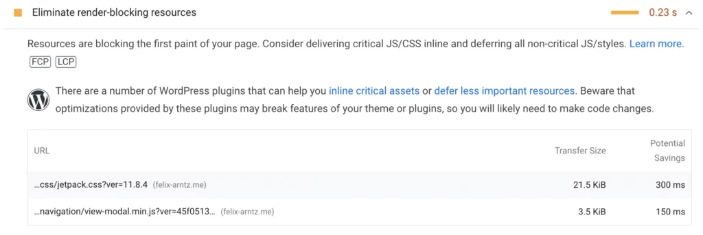
Not just one but two recommendations were about the jetpack.css file that was being loaded on the page which contained a lot of unused CSS and furthermore was render-blocking. Remember the WebPageTest result I linked above that was pointing out my updated site still loaded a lot of CSS? My site was loading 28 KB of CSS in total, and now it turns out 21.5 KB of those come from the jetpack.css file!
The only feature of Jetpack that I use in the frontend of my site is the Subscribe block that you can see in my site footer. There’s no way that simple text input and button needs 21.5 KB of CSS. Looking through the code of Jetpack, I found that that this massive file is enqueued on every page, regardless of the content. Wow – enqueuing a massive stylesheet on every page regardless of content is just so “classic theme”. 🙄
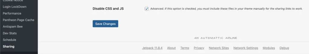
At least I found out by digging further through the code that apparently there is a setting in Jetpack to turn off the CSS file. The name of the setting indicated that the CSS had to do with Jetpack’s sharing feature, which I do not use on my site. So it should be safe for me to just remove it. Initially I couldn’t find where to control that setting in my WP Admin UI though. Turns out I first had to temporarily enable the sharing feature, in order for its admin screen to be available under “Settings > Sharing”. From there I could disable the CSS. Afterwards, I disabled Jetpack’s overall sharing feature again, and that fortunately did it. The massive CSS file was gone.
When I loaded my frontend, the Jetpack Subscribe block looked just like it did before. So I really didn’t lose anything by removing this file, but I saved a lot of bandwidth and likely gained an even faster load time. Also my CSS was now down to only ~7 KB. Remember that that was also the amount of CSS I had in the old version of my site with the AMP plugin’s tree shaking feature? That means that, as long as you stick to the block theme best practices, you’re more or less just as good as a CSS tree-shaker would be – which is huge!
Image without width and height
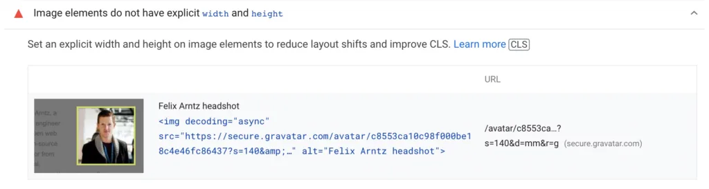
Another recommendation PSI showed was the lack of the dimension attributes width and height on one of the images, specifically my Gravatar profile photo that I am using in the footer of my page.
This type of problem is not related to load time, but missing dimension attributes contribute to worse CLS. While this image realistically would never be visible on the initial page load, I still thought it would be a good idea to fix it. Especially since all it involved was editing the specific core/image block to manually set width and height on it so that they would explicitly appear on the image element as attributes.
The results: Even better performance
After having implemented the above changes and deployed them to my site, I conducted another set of WebPageTest comparisons similar to the ones from before (i.e. 36 more requests for my “desktop” and “mobile” test configurations).
Below you find a summary of the “mobile” results, now encompassing all three scenarios: Before I deployed my new TT3 child theme setup, after I deployed it, and now the additional scenario after I had made the additional performance tweaks. Here are the median metrics:
| Metric | Before initial site update | After initial site update | Difference in % | After further performance tweaks | Difference in % |
|---|---|---|---|---|---|
| TTFB | 700ms | 700ms | 0% | 699ms | -0.14% |
| FCP | 1596.5ms | 1003.5ms | -37.14% | 979.5ms | -38.65% |
| LCP | 1778.5ms | 1376.5ms | -22.60% | 1153.5ms | -35.14% |
| LCP – TTFB | 1076.5ms | 674ms | -37.39% | 452.5ms | -57.97% |
| CLS | 0 | 0 | 0% | 0 | 0% |
| DOM Elements | 706 | 511 | -27.62% | 509 | -27.90% |
| Total Bytes | 892777 | 418101 | -53.17% | 389505 | -56.37% |
As you can see, the few performance tweaks I outlined above had another massive impact. With the block theme alone, LCP on mobile had improved by 23%, and with those few additional tweaks those 23% became 35%! Overall, I was able to improve my site’s client-side performance (LCP – TTFB) by 58%!
You may not believe that, but trust me, the 3 above performance recommendations that PageSpeed Insights had pointed out were all that was needed to get to those even better load time metrics. Investigating and implementing those performance enhancements literally took me 20 minutes. Granted, I was very familiar with the LCP lazy-loading problem, so I knew exactly how to fix it, but even if it had taken a bit longer, definitely so worth the investment. This is a great reminder that when it comes to performance, the last small polishing steps can go a long way.
After making the tweaks, I also did another PageSpeed Insights run over my home page to see its updated assessment. Below you find screenshots of the two runs side by side: On the left, before I made the additional performance tweaks, on the right, after I made them.
At this point feel free to dive further into the full results which I have made available in this spreadsheet. Additionally to the median metric values that I already shared above, the spreadsheet includes links to all WebPageTest runs, percentile values for all metrics, and even the individual metrics for every single run.
Conclusion
While I had been excited about the potential of block themes for improving performance from the very beginning, I am still blown away to see those benefits in practice. As shared above, I was able to improve my site’s overall load time (measured via LCP) by 45% on “desktop” and 35% on “mobile”. Especially the client-side advantages of block themes are hard to resist.
I also have to say that the experience of rebuilding my site using a block theme was very solid. I know several folks in the WordPress community are still hesitant towards that significant change in paradigm, and don’t get me wrong, there are still lots of things to improve further. But full site editing and block themes have gone a long way since they launched in WordPress 5.9, and I can with confidence say that it was the right decision for me to jump on that train now. If you tried block themes a while ago and weren’t satisfied, maybe give it another try. And even as you find problems, please share them, help the core team, contribute back if you have time.
Last but not least, I want to acknowledge that this major change in paradigm of how WordPress works and how we as developers and designers have to work with WordPress is a challenge. Some of us have been developing themes and plugins for more than a decade in the “classic” way, so it’s just natural that some doubts over the new paradigm are raised. But I also think that anyone of us in the WordPress community that raises a concern about full site editing and block themes need to ask themselves: Which of those concerns do we raise just because our own convenience and being used to the “classic” way vs which concerns would we still consider a problem if we started looking at WordPress today? There is no doubt that block themes provide a better foundation than classic themes when it comes to building performant WordPress sites. It is up to us to embrace that and enhance the block ecosystem further.
Leave a Reply